

What does Dovetail do?
Dovetail is a research and customer insights platform that helps teams store, analyse and share user feedback to make better product decisions.

Case Study
Simplifying path to purchase
Project Overview
As the product designer supporting Growth, I led design across onboarding, reverse trials, free-to-paid flows and early AI feature adoption. Our goal: help new users reach value faster and increase self-serve paid conversion.
While I worked across multiple projects, the most impactful and urgent opportunity sat at the bottom of the funnel: our checkout flow. The existing multi-page payment experience introduced friction at every step. Improving conversion meant we needed to transform checkout into a fast, trustworthy, self-serve experience.
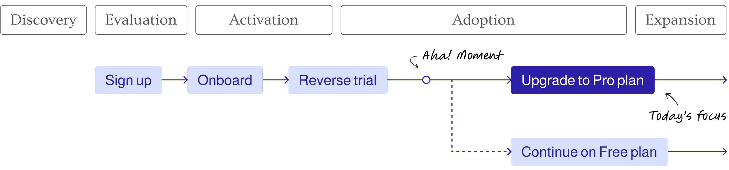
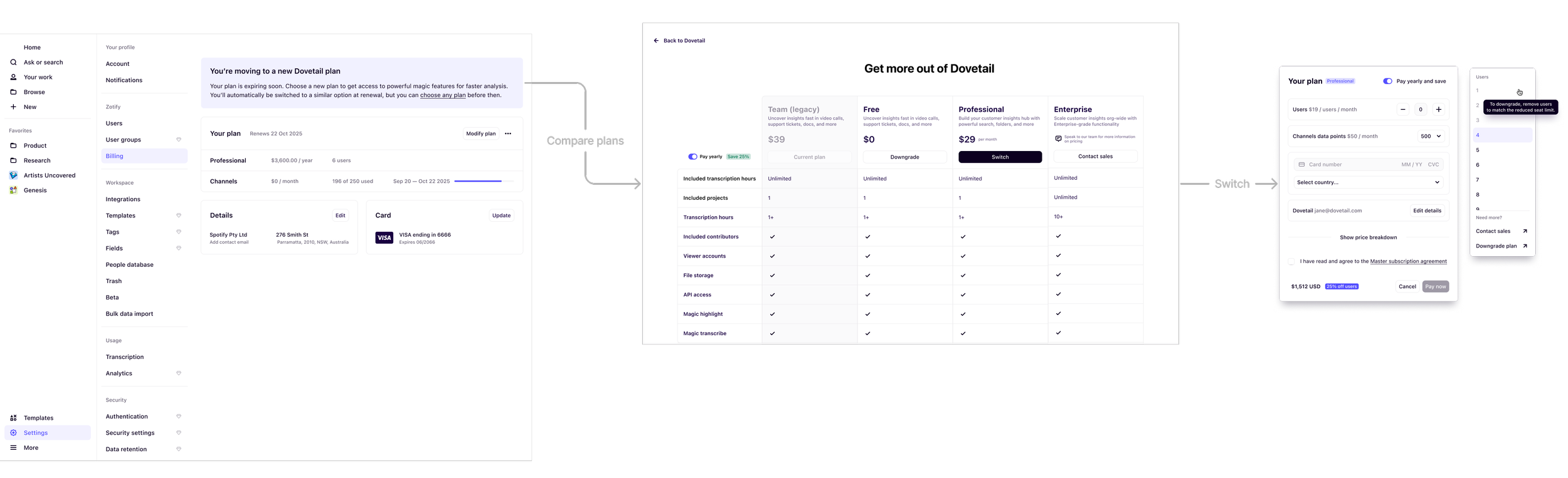
Self-service Growth Funnel
The Problem
Before July 2025, upgrading in Dovetail was slow, disjointed and often required talking to support. Across Free, Pro and Enterprise, users experienced:
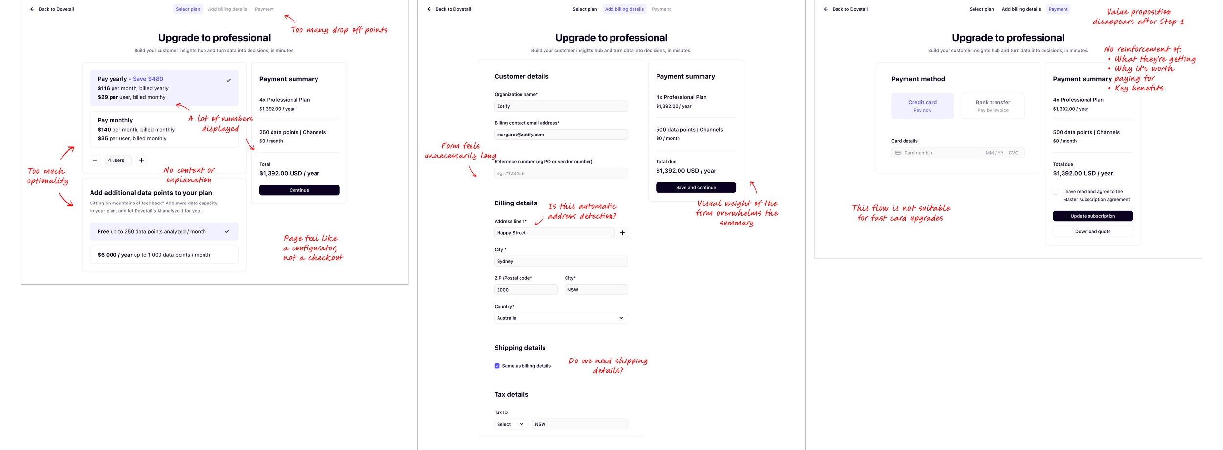
A multi-page checkout with unclear steps
Confusion around seat counts and add ons
No self-serve path for enterprise upgrades (support only)
No functionality for free users trying to purchase Channels without seats
High drop off on seat selection and payment entry
Limited entry points to purchase
These issues hurt conversion and increased support load. Free users couldn’t easily explore new features, Pro users hit billing friction and premium customers lacked autonomy.
Our Goal
Our goal was to streamline the checkout experience that allowed users to self-serve upgrades, manage seats and purchase add-ons like Channels data points - all without needing customer support intervention.
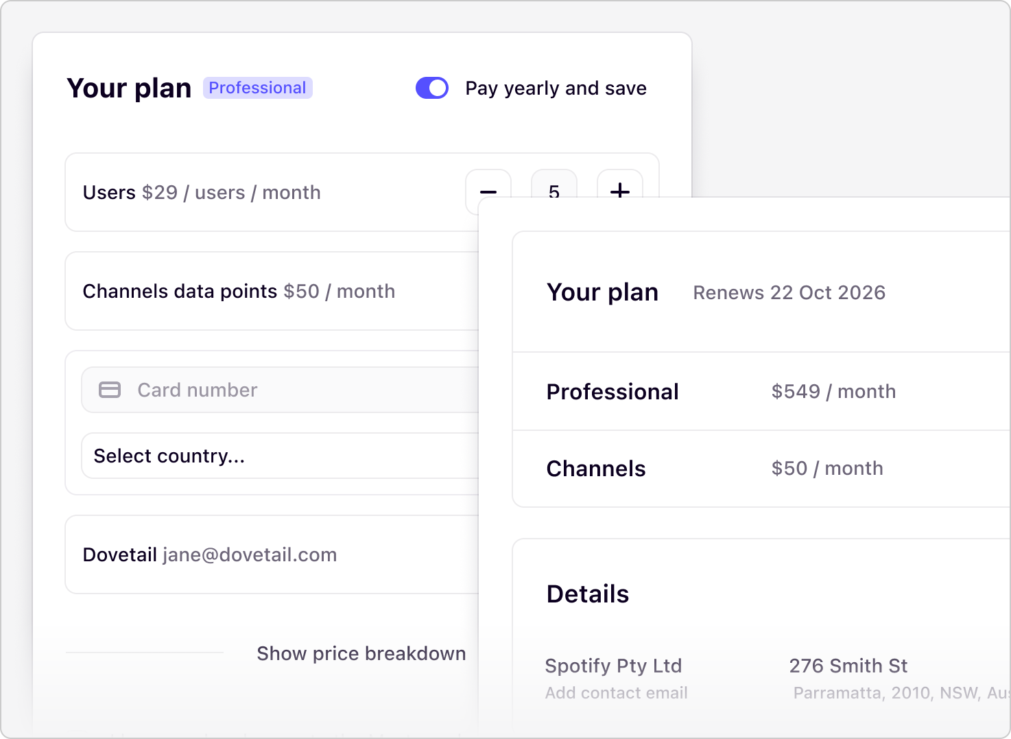
Current Payment Flow

Multi Page Payment Flow
Existing Billing/Invoice Page

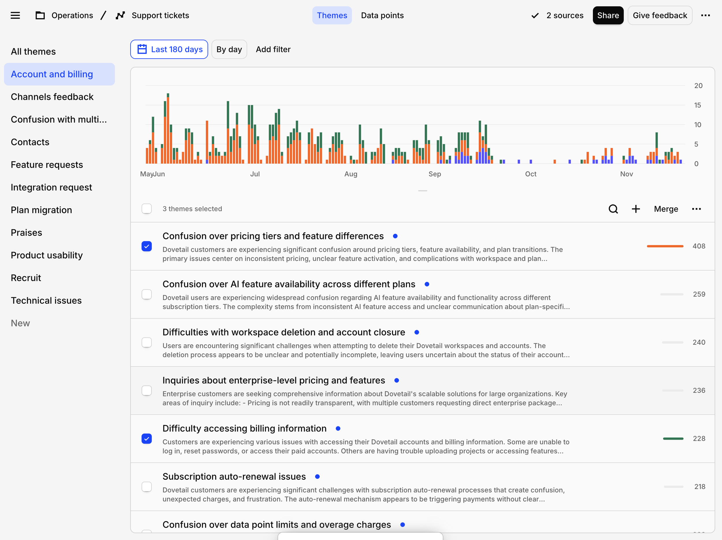
Research & Insights
To understand where friction lived and validate initial design concepts, I ran usability interviews, synthesised analytics and support tickets.
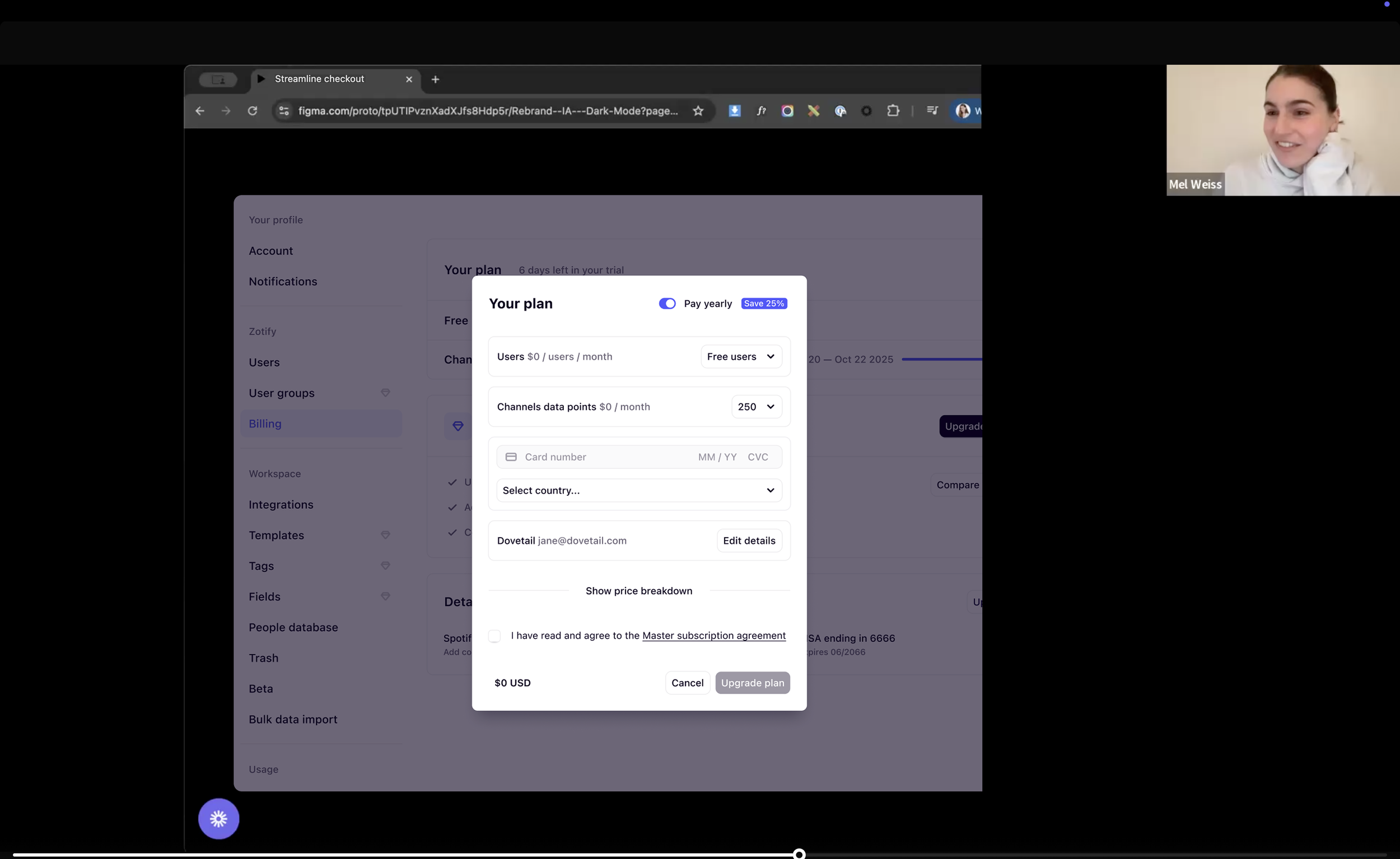
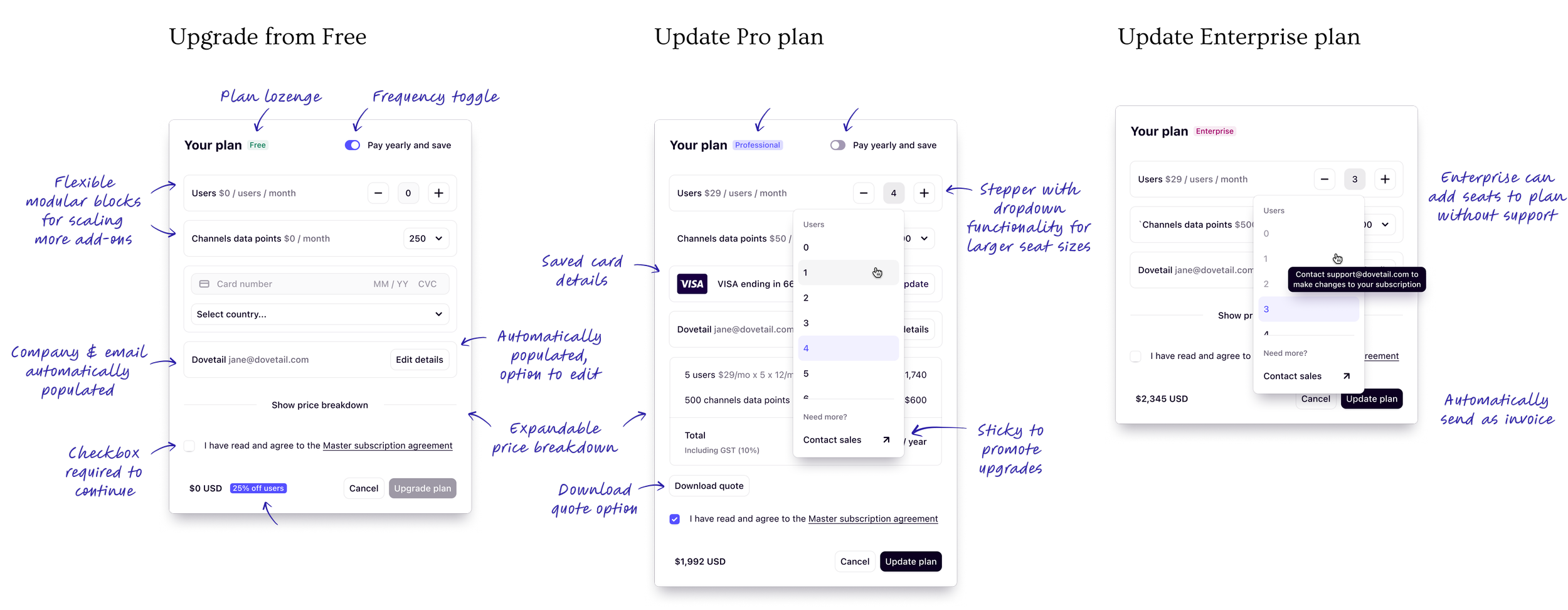
New Flow


Key Learnings
Discount Clarity
The “save 25%” label caused confusion because the discount applied only to user seats, not to Channels
Seats vs. Channels
Users found seat counts and Channels data points difficult to understand since they’re independent/optional add-ons that don’t relate to each other
Plan Visibility
Because the checkout dialog became more flexible and adapted to multiple upgrade paths, users needed clearer visibility into which plan their workspace was currently on
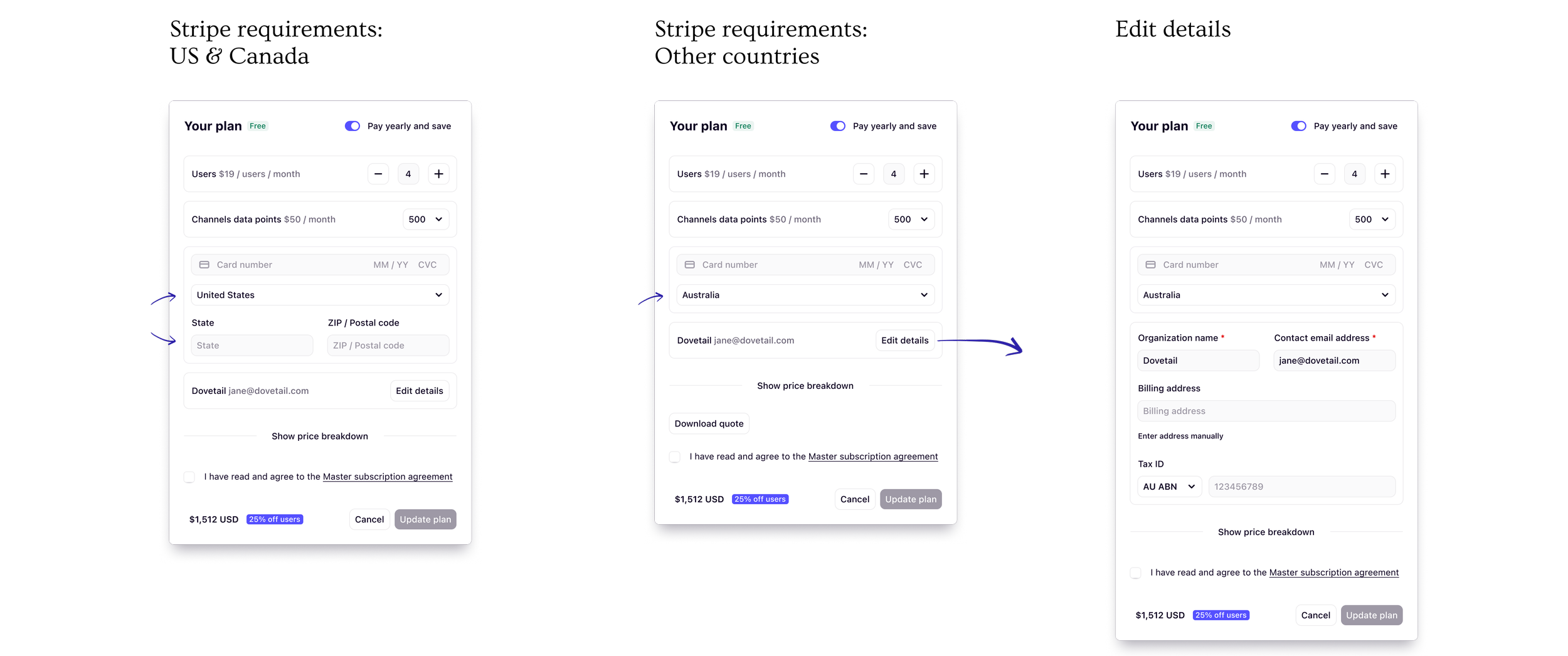
Billing Details Tradeoff
While billing details matter, we intentionally prioritised simplicity in checkout and allowed users to manage full billing information from the settings page instead
Designs

Entry Points: In Context

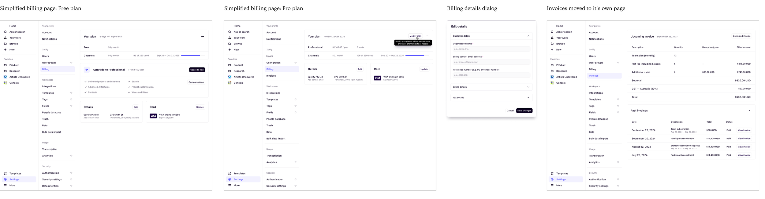
New Billing Pages
Migrating existing customers to the new plan
What We’re Monitoring
Improved self-serve paid conversion (Free to Pro, Pro expansion)
Drop-off rates from new checkout dialog
Clarity and comprehension of seats and channels selections
Frequency and themes of billing-related support tickets
Plan visibility and whether workspaces better understand what they’re currently on
Long-term retention and upgrade patterns following the redesign
Impact, So Far
Self-serve paid conversion increased from 4.2% to 5.2% (~24% lift)
This uplift was supported by other Growth initiatives running in parallel
Drop-offs during payment & seat selection decreased by ~32%
Billing-related support tickets decreased by ~27%
Learnings
Seats vs Channels are confusing
Seats and Channels remain conceptually confusing since they’re not mutually exclusive and both are optional
Simplicity reduces cognitive load
Simplifying seat management alone removed a major drop off point, highlighting how much friction existed in the previous flow
Phase three wasn’t fully realised
Shifting priorities meant we couldn’t deliver this feature to its full potential. With further enhancements and optimisation, the impact on conversion could have been significantly higher
Sequencing matters
Shipping foundational UX improvements (onboarding, free plan, upsell tactics) before the billing redesign helped amplify the overall impact